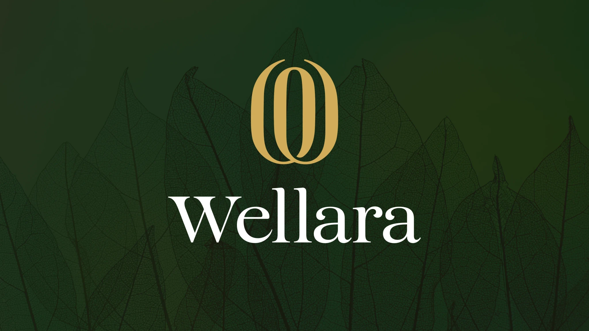
Wellara

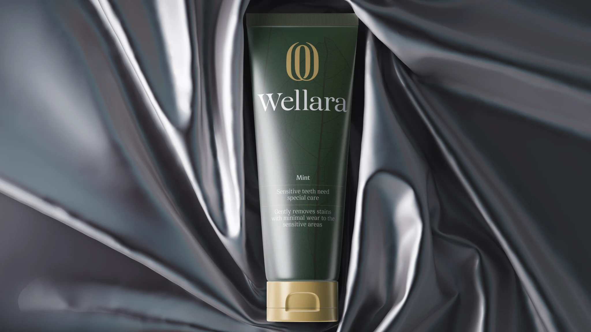
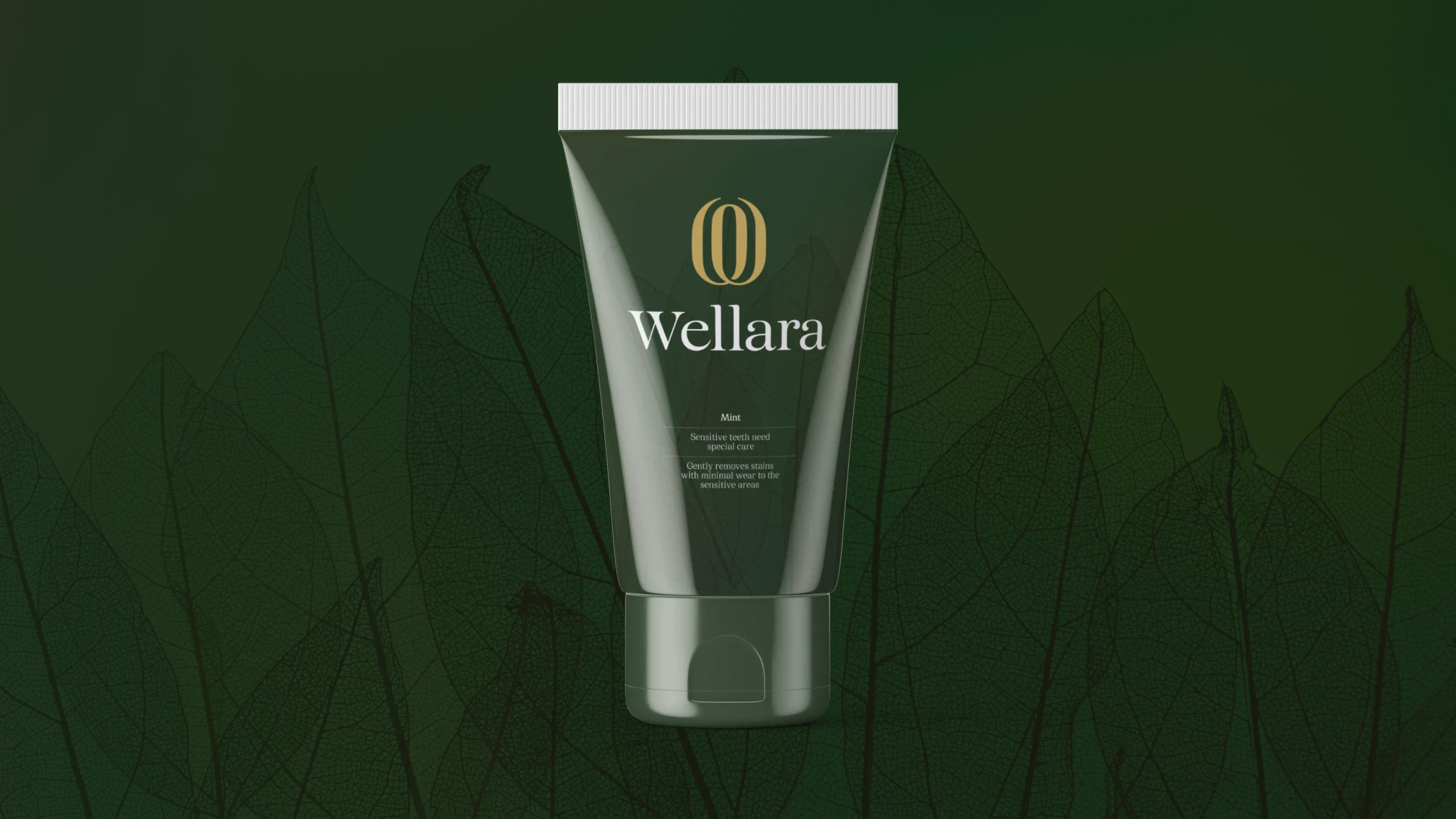
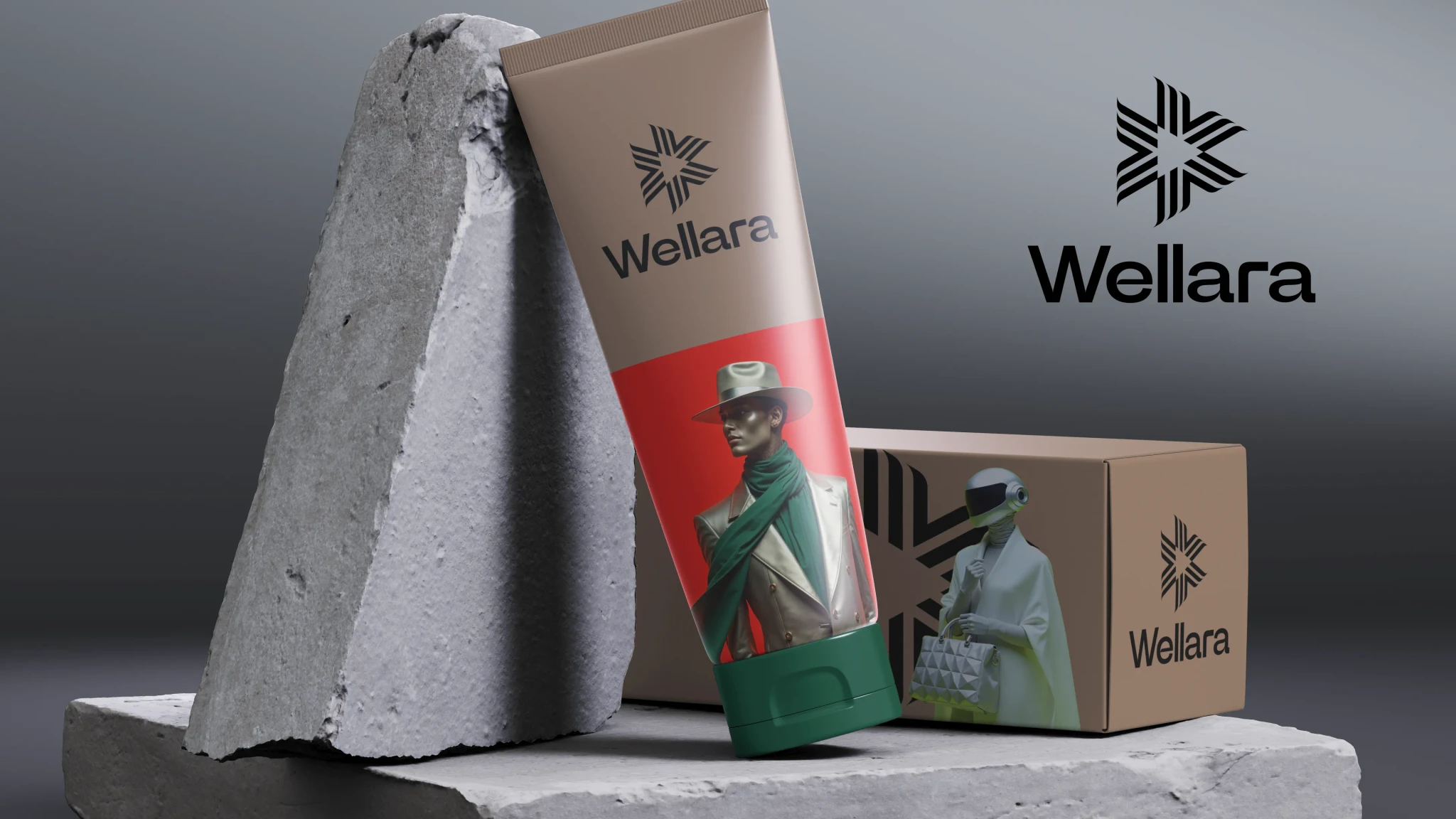
For Wellara Brand, I’ve been working on designing sleek, modern packaging for their cosmetics, toothpastes, and brushes. The work is still in progress, with a focus on capturing the brand’s identity and ensuring the designs strike the perfect balance between aesthetics and functionality. Each step of the process is guided by Wellara’s commitment to quality and innovation.
This case is a great example of how I approach branding and visual identity work. I always start with an in-depth briefing session to understand the client’s vision, values, and market. Then I explore multiple creative directions — from bold and experimental to minimal and elegant — presenting several logo and visual concept options for discussion.


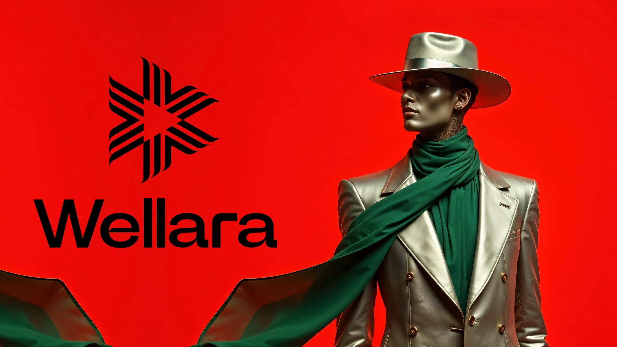
Future-Ready, Fashion-Driven
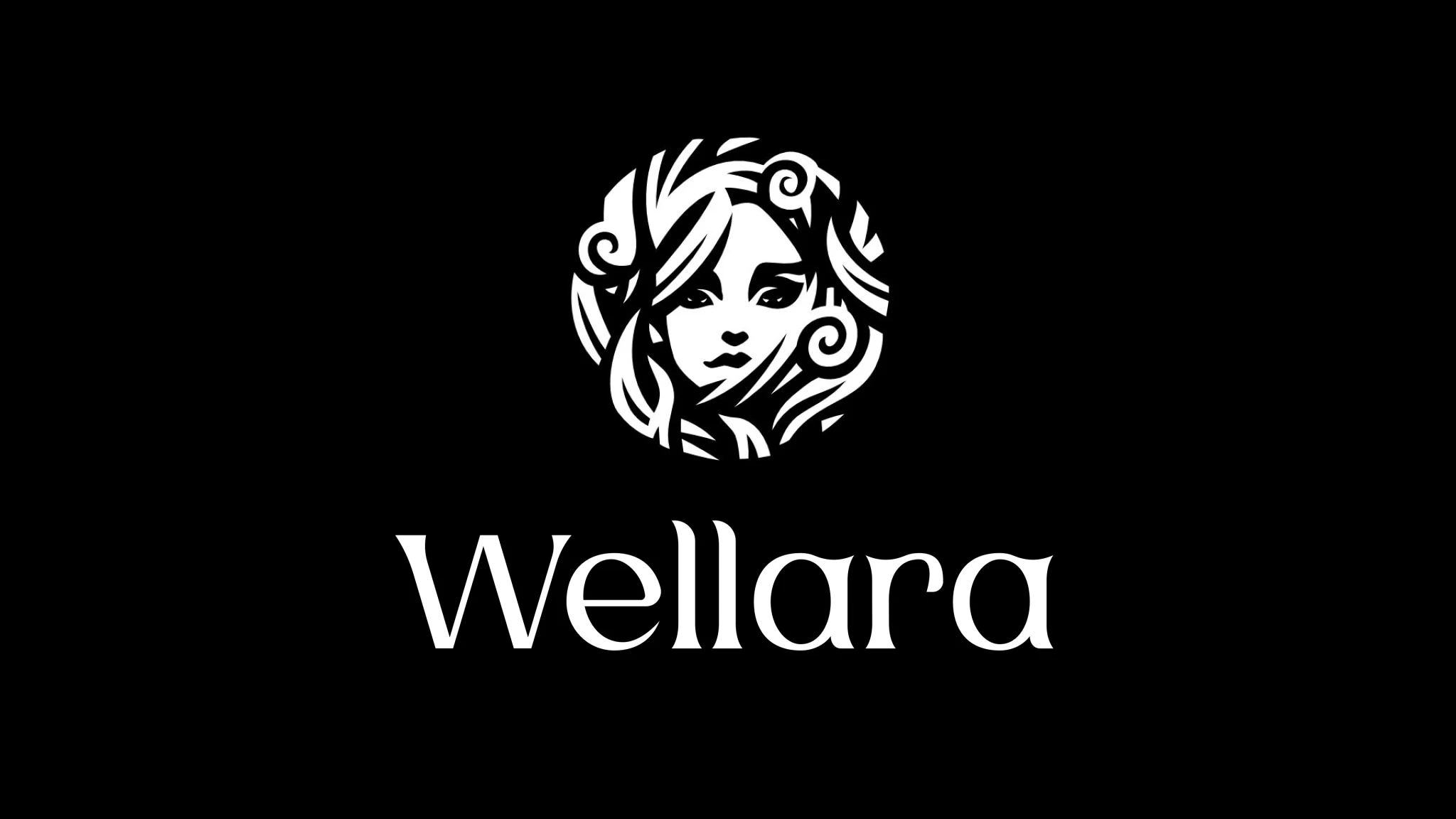
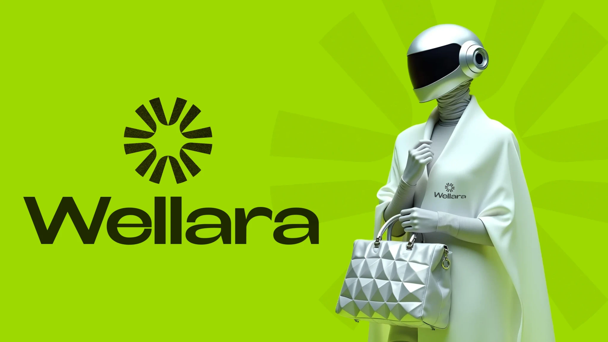
A bold reinterpretation of luxury — this version of the Wellara identity brings together sharp geometry, striking contrast, and high-fashion elegance.
The logo reflects movement and precision, while the futuristic styling of the character speaks to the brand’s ambition to challenge norms and redefine beauty on its own terms.

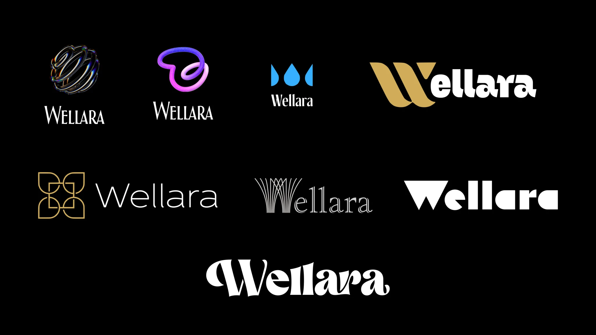
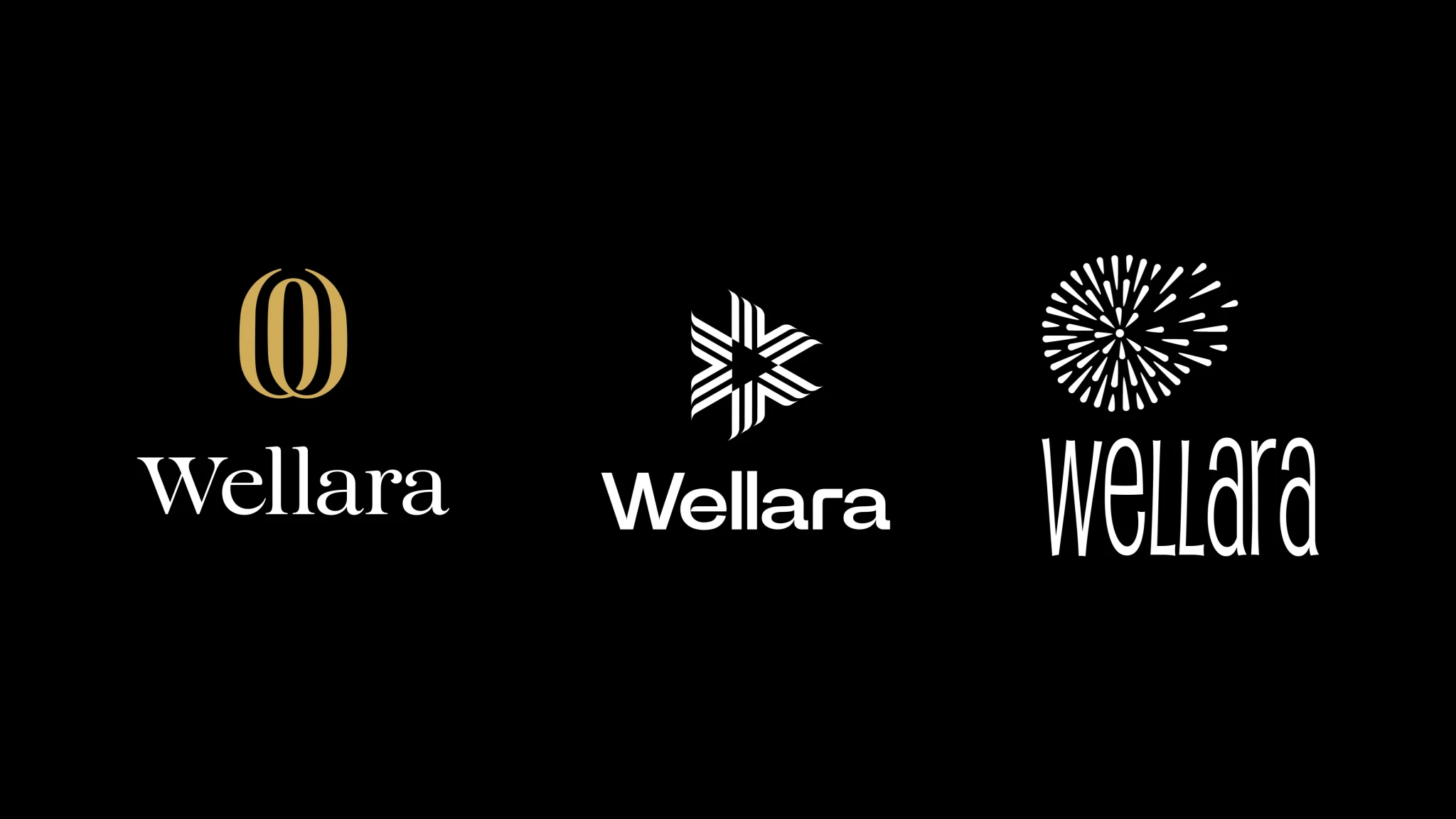
In the early stages of the Wellara branding, I created over 10 distinct logo directions, each with its own mood, typography, and symbolic logic. From sleek and minimalistic marks to expressive geometric signs, every option was rooted in a different visual narrative — inspired by type systems, pattern design, and iconic brand references.
This phase wasn’t just about variety — it was about pushing the boundaries to find what felt right. When I work on identity, I always bring a wide spectrum of ideas to the table. My creative process is driven by curiosity, and my goal is to give the client not just one solution, but a whole universe of possibilities to choose from.
The ideas don’t run out — they evolve.