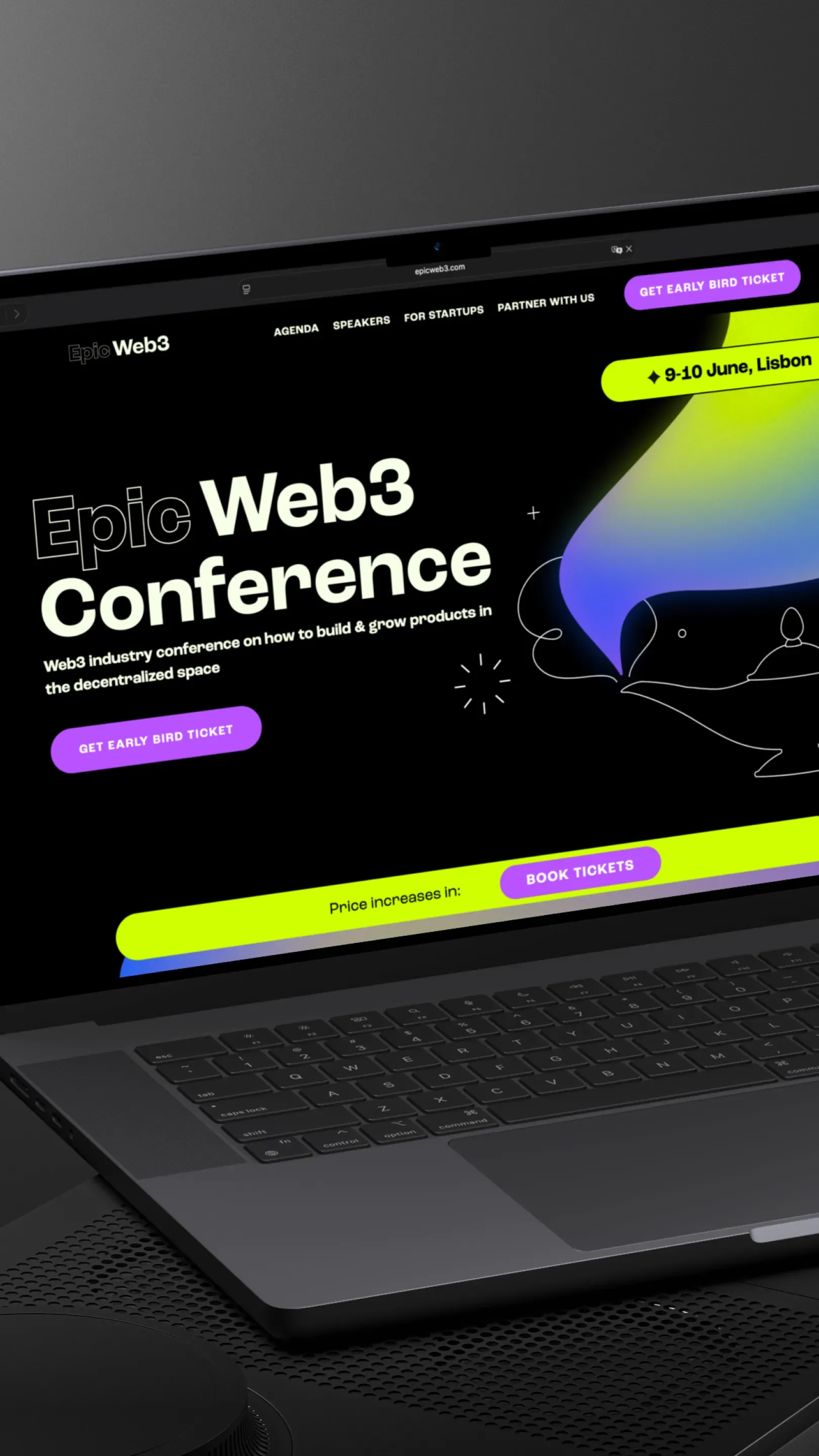
I built the entire landing page on Webflow using grids, which was both challenging and exciting — making sure the designer’s vision translated well across different screen sizes. A lot of extra effort went into fine-tuning the mobile version to keep the layout clean and functional.
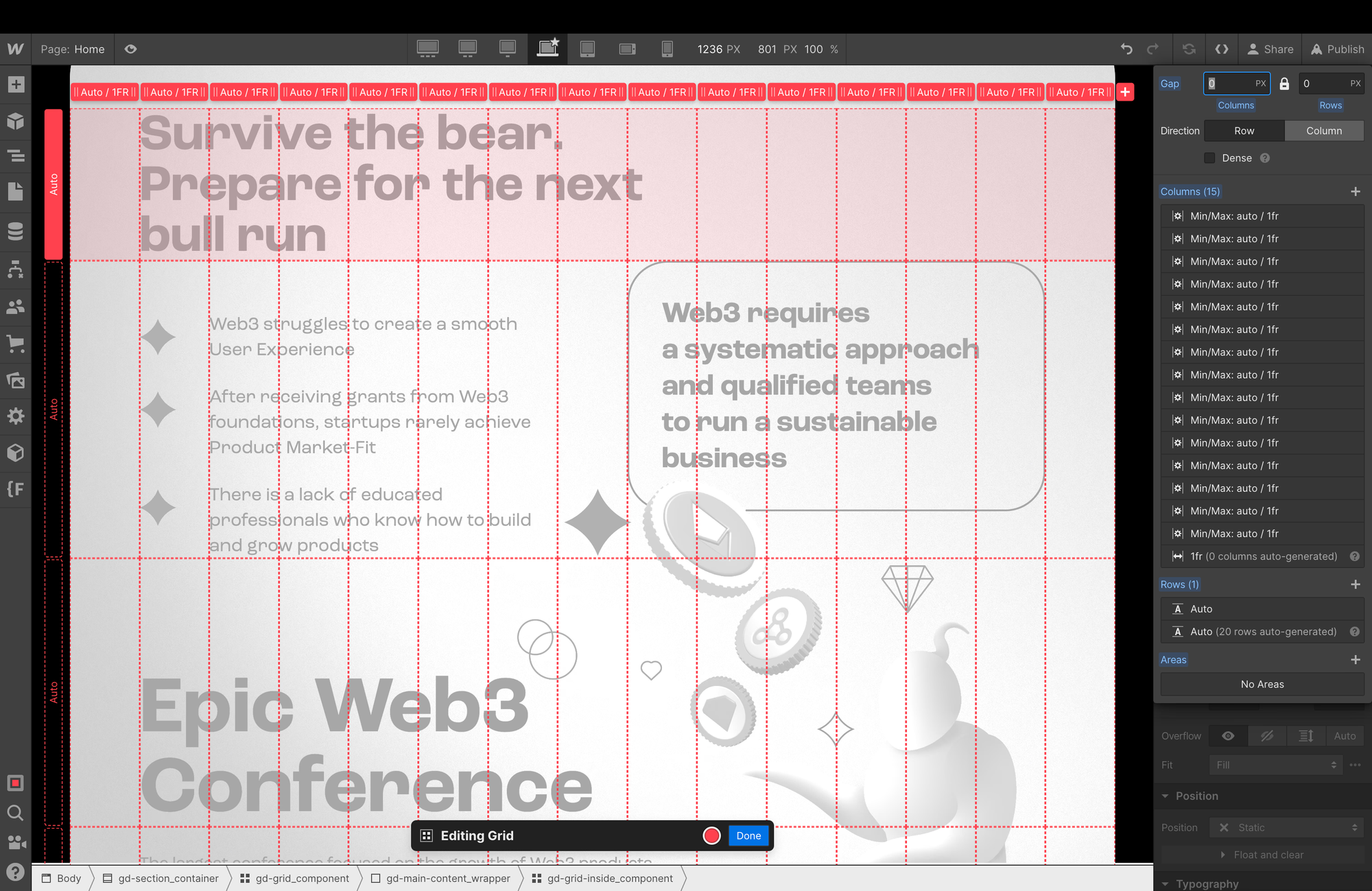
The project grid system was based on a 15-column layout with no gutters, giving enough flexibility to structure complex sections while keeping everything visually balanced.
Read-only link
I assembled this project in Webflow using a 15-column grid system without gutters, which gave me flexibility to adapt complex layouts across different screen sizes. The process required balancing the original design intent with responsive adjustments, especially for the mobile version where I fine-tuned spacing and hierarchy. You can check the full build and see how the grids were applied through the read-only Webflow link.


